Short answer: To read aviation radar displays, start by identifying aircraft icons (airplane symbols), then read their color and direction. Click or tap on an aircraft to see its altitude, speed, and flight path. Each display uses consistent symbols for airports, weather, and terrain, so learning these basics helps you interpret any flight tracking tool.
Key takeaways
- Aircraft icons vary by platform, but all show position and direction of travel.
- Altitude is usually displayed in feet and can be shown as a number or on a vertical profile.
- Ground speed is typically in knots or mph, and it represents speed relative to the ground.
- Flight trails show where a plane has been and can be color-coded by altitude.
- Weather and terrain layers help explain delays or route changes.
- Most radar displays let you click or tap any aircraft for detailed flight information.
What you will find here
- What Are Aviation Radar Displays?
- Decoding the Aircraft Icons
- Understanding Altitude and How It’s Shown
- How Is Speed Displayed? Ground Speed vs. Airspeed
- Reading Flight Trails and History
- What Are the Different Symbols and Layers?
- How to Get Details for a Specific Flight
- Common Mistakes Beginners Make When Reading Radar
- Practical Tips for Using Flight Tracker Radar Like a Pro
What Are Aviation Radar Displays?
When you open a flight tracker and see a map full of little airplane icons, you’re looking at an aviation radar display. But here’s the thing: it’s not actual radar in the traditional sense. These displays are visual maps that combine data from several sources—primarily ADS-B, MLAT, and radar—to show you where aircraft are, where they’re headed, and how fast they’re going.
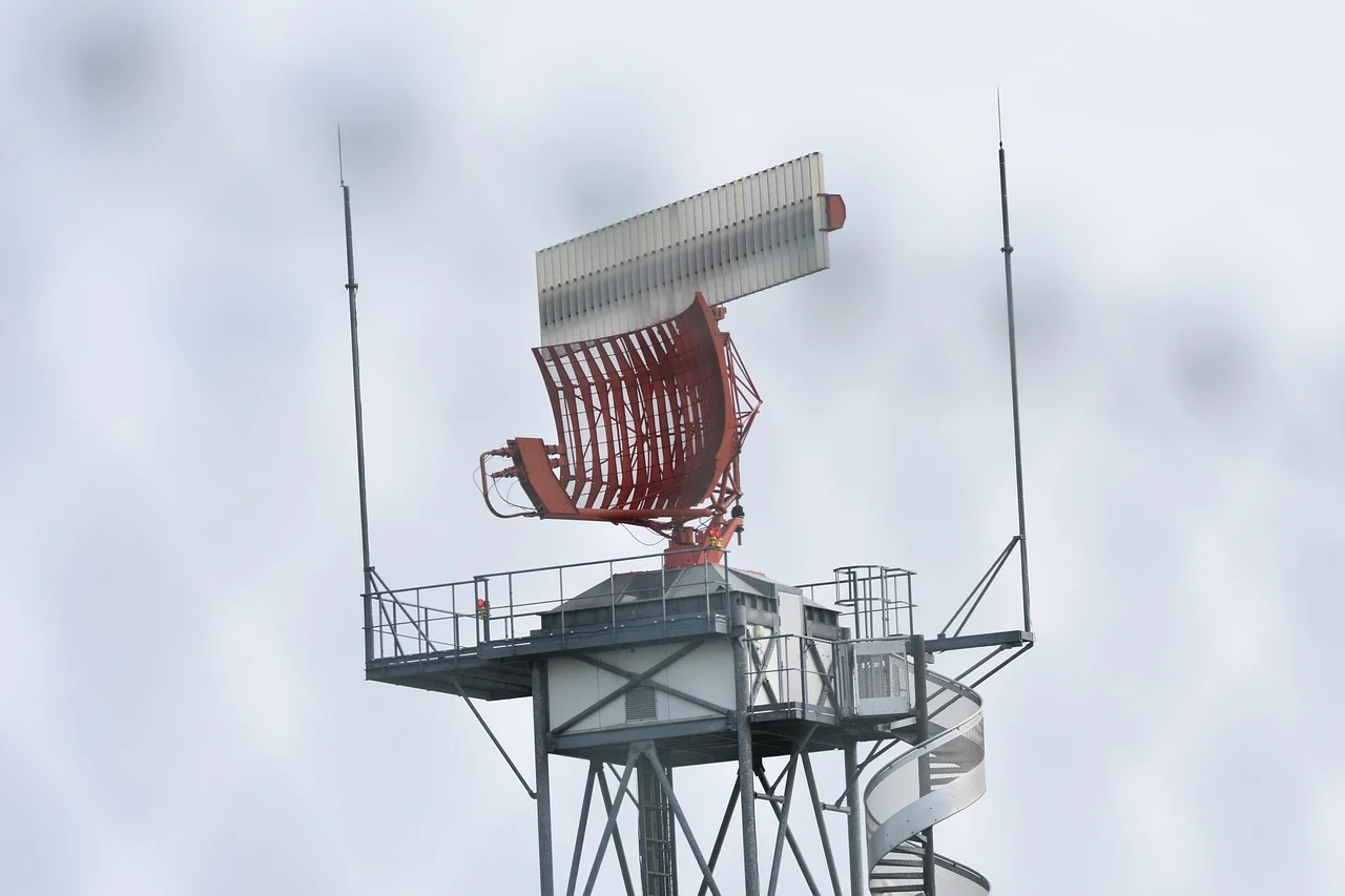
ADS-B, which stands for Automatic Dependent Surveillance–Broadcast, is the backbone of most modern trackers. Aircraft broadcast their position, altitude, and speed via GPS, and ground stations pick that up. MLAT, or multilateration, steps in when an aircraft isn’t broadcasting ADS-B—it uses the time difference between signals received at multiple stations to triangulate a position. Traditional radar, the kind with spinning antennas, fills in the gaps for areas without coverage.
The display you see updates frequently, often in near real-time. Some trackers refresh every few seconds. Others might have a slight delay—sometimes by minutes—depending on the data source and privacy restrictions. If you’re tracking a friend’s flight, that near-real-time update is a huge comfort: you’ll know when wheels are down or when they’re climbing out.
It’s easy to mistake these displays for weather radar, especially since they share a similar look. But they serve a very different purpose. Weather radar shows precipitation and storm movement. Aviation radar displays track flights—every commercial airliner, many private jets, and sometimes even helicopters. You’re not seeing clouds; you’re seeing planes. That difference matters when you’re deciding whether to head to the airport or just refresh the map one more time.
Decoding the Aircraft Icons
When you first pull up a flight tracking map, the icons may look like a jumble of little planes. But they hold a lot of information at a glance. Most trackers show each aircraft as a small silhouette that points in the direction it’s flying. So a plane heading northeast on the map will have its nose tilted that way. That orientation makes it easy to see traffic flow at a glance.
Some displays change the icon shape based on the type of aircraft. A regional jet might appear as a narrower, sleeker silhouette, while a heavy airliner looks wider and longer. If you’re looking at a map that includes general aviation, small single-engine planes often show up as simpler, lighter shapes. Not every tool does this, but many free trackers do to help you tell a Cessna from a 737 without clicking.
Color is where the real-time status comes in. On many radar displays, blue or green means the aircraft is cruising at a steady altitude. Yellow or orange might indicate it’s climbing or descending. Red can flag a rapid altitude change or a potential conflict. These color codes vary by platform, so always check the legend on the site you’re using. The difference between a climbing and cruising icon might be subtle, like a tiny arrow next to the plane.
Then there are the grayed-out or hollow icons. When an aircraft isn’t actively transmitting its position, often because it’s in a dead zone or on the ground with its transponder off, the icon may appear faded or outlined. Think of it as a placeholder. The data may be delayed by a few minutes, so don’t rely on it for close-range separation. Just know that a solid, bright icon is usually live, while a gray one is stale or partial.
Start by watching one plane. Note its shape, direction, and color. Then compare it to a neighbor. You’ll pick up the patterns quickly, and soon you’ll be reading the whole board like a pro.
Understanding Altitude and How It’s Shown
Altitude tells you how high an aircraft is flying, and on most radar displays, it’s shown in feet. You’ll see a number next to the aircraft icon—like 35,000 or 12,500—or you might need to click on the plane to bring up its details panel. That panel shows the exact altitude at that precise moment, which is helpful when you’re tracking a specific flight.
Many displays also color-code the aircraft or its trail based on altitude. The idea is simple: cooler colors like blue and green represent lower altitudes, while warmer colors like yellow, orange, and red indicate higher ones. The color scale is usually shown somewhere on the map, so you can glance at a plane’s color and instantly gauge its approximate height before you even read the numbers.
There’s an important distinction to keep in mind: most aviation charts reference altitude as Mean Sea Level (MSL), which is the height above the ocean’s average level. However, some apps or features might show height above ground (AGL), which tells you how high the plane is above the terrain directly below it. That can be very different over mountains or in flat country. If you’re near an airport, you might see AGL used for local traffic patterns, but for en-route flights, MSL is the standard.
When you click on an aircraft, you’ll get its current altitude, often along with its vertical speed—whether it’s climbing, descending, or level. This is handy for spotting which planes are on approach or just taking off.
How Is Speed Displayed? Ground Speed vs. Airspeed
When you look at a radar display, the speed you see is almost always ground speed. That’s because radar tracks how fast an aircraft moves across the ground, not how fast it’s moving through the air. It’s a simple positional calculation—the system measures distance over time and gives you a number.
Ground speed and airspeed are two different things. Airspeed is how fast the plane is moving relative to the surrounding air. Ground speed is how fast it’s moving relative to the ground below. The difference comes from wind. A strong tailwind can push an aircraft’s ground speed well above its airspeed, while a headwind does the opposite—it can make ground speed lower than airspeed, even though the plane is still flying efficiently through the air.
For practical purposes, ground speed is what matters for arrival times and route planning. If you’re tracking a flight, that’s the number you’ll want to pay attention to.
Speed on radar is typically displayed in knots—nautical miles per hour—because that’s the aviation standard. Many tracking websites and apps let you switch to miles per hour or kilometers per hour if you prefer. But if you stick with knots, you’ll be reading the same numbers pilots and controllers use.
One quick thing to remember: don’t be alarmed if a speed seems unusually high or low during strong winds. The plane isn’t necessarily struggling—it’s just dealing with the atmosphere. Ground speed tells you what you need to know for planning, but airspeed is about the aircraft’s performance.
Reading Flight Trails and History
Flight trails are the lines you see extending behind each aircraft icon on a radar display. They trace the plane’s recent path, showing you where it has been in the last few minutes. Think of them as a breadcrumb trail left across the sky.
These trails aren’t just decorative. They can reveal a lot about what the aircraft is doing right now. Here’s what to look for:
- Trail shape: A straight, consistent trail means the plane is flying a steady course. A curved or looping trail often indicates a holding pattern or circling maneuver, usually due to traffic congestion or weather avoidance.
- Trail appearance: Some displays show solid lines, others fade with time (older positions become lighter). Some radar tools color-code the trail by altitude—for instance, blue for lower, green for mid, red for higher. This lets you see at a glance whether the plane is climbing, descending, or level.
- Trail direction: Look at which way the trail points relative to the icon. The trail always extends behind the aircraft, so it shows the direction the plane came from. If the trail suddenly changes angle, the plane turned. If it’s a smooth curve, it’s a gentle turn.
Keep in mind that trails typically cover only the last 10 to 30 minutes of flight, depending on your radar app. So they give you a short-term history, not the whole journey. But within that window, they’re an excellent tool for spotting deviations early. If you see a trail that loops back on itself, the pilot is likely buying time—either waiting for clearance or dodging bad weather.
When you’re tracking a loved one’s flight, a loop might look alarming, but it’s often routine. Instead of worrying, check the altitude and speed readouts alongside the trail. If those remain stable, the plane is simply holding until it’s cleared to proceed.
What Are the Different Symbols and Layers?
Airports are usually the easiest symbols to spot. Many displays show them as small plane icons or circles, and they nearly always include an identifier like KLAX or JFK. Sometimes you’ll also see the airport’s name if you zoom in close enough. When you see a symbol with a four-letter code, you’re looking at an airport—that code is the ICAO identifier used internationally.
Beyond airports, you’ll encounter waypoints. These are navigational reference points that pilots use to chart their routes. They often appear as small diamonds, triangles, or crosses with abbreviations next to them. Some displays show VORs (radio beacons) as hexagons, but you don’t need to memorize every detail to get useful information from a screen.
Weather layers are where things get colorful. Precipitation often shows up in shades of green, yellow, and red, with red indicating the heaviest rain or storms. Some services overlay satellite imagery, which can help you spot cloud cover, and others go further by highlighting storm cells with special alerts. If you see a pulsing icon or a distinct red blob, that’s usually a storm that warrants attention.
The key to making sense of all this clutter is layer control. Most radar tools let you toggle different layers on and off. You might start with just aircraft and airports, then switch on weather only when you need it. Turning off traffic or altitude labels can clear the screen instantly.
Take a minute to click through the menu and see what each layer does. You’ll quickly learn which ones matter for your typical viewing. Once you recognize a handful of core symbols, the rest falls into place.
How to Get Details for a Specific Flight
Selecting a specific aircraft is the most direct way to get answers. On most radar displays, you simply click or tap the aircraft icon to open a detailed info box. That box is where the real utility lives.
Once you open it, you’ll typically see the flight number and airline, along with the aircraft type—like a Boeing 737 or an Airbus A320. The box also shows the origin and destination airports, often with their city names and IATA codes. You’ll find altitude and speed there too, usually updated every few seconds.
One of the most useful elements is the vertical flight profile. This small graph shows the aircraft’s altitude over time, giving you a sense of whether it’s climbing, cruising, or descending. If you’re tracking a loved one’s flight, that profile can tell you when they’ve started their descent toward the destination.
Many displays also show the remaining flight time and the distance to the destination. That’s handy when you’re planning pickup times or just want to know if the flight is on schedule. Some info panels even include estimated arrival times, which adjust as conditions change.
Don’t be afraid to click around. Each radar site or app has its own layout, but the core details are consistent. Once you get used to reading that panel, you’ll find it’s your go-to source for a single flight’s story.
Common Mistakes Beginners Make When Reading Radar
When I first started using flight trackers, I made plenty of errors. The most common one? Thinking the little airplane icon is drawn to scale. It’s not. That icon is often many times larger than the plane would appear on the map. So don’t judge distance or altitude by how big the icon looks. It’s there for visibility, not accuracy.
Another frequent slip-up is not checking whether the map is north-up or track-up. North-up means north is at the top, as you’d expect. Track-up rotates the map so the aircraft’s direction of travel is always up. If you’re not paying attention, you can get hopelessly confused about which way the plane is heading. Look for the orientation indicator—usually a small compass or an ‘N’—and adjust your reading.
Time zones can throw you off too. The arrival and departure times on a flight’s details page might be shown in local time at the respective airports, not your timezone. So if a flight’s scheduled arrival shows 14:00, that could be in the destination’s local time, not your own. Check the time zone labels carefully.
Finally, remember that radar displays often have a slight delay. The aircraft’s position you see might be several seconds—or even a minute—old. That means your loved one’s plane may actually be a little further along than what you’re seeing. Don’t panic if the map seems to lag; it’s normal. Just refresh if you want the most current data.
Practical Tips for Using Flight Tracker Radar Like a Pro
First, make friends with the filter function. If you only care about airliners, hide the small planes and general aviation traffic. That cleans up the screen fast. Likewise, you can filter out international flights if you’re focused on regional traffic, or vice versa. It takes seconds and makes everything easier to read.
When you need a specific flight, don’t zoom around hunting for it. Use the search box and type the flight number or airline. Most trackers let you search by route too, like “New York to London,” which is handy when you don’t know the number.
Check the refresh rate. Some apps update every few seconds, others lag by a minute or more. Look for a timestamp on the screen—it tells you how current the data is. If you’re tracking a flight that’s close to landing, a slow refresh can make it look like the plane is hovering. Know what you’re looking at.
One more thing: if you’re tracking a loved one, don’t just stare at the screen. Refresh the page or app periodically. You’ll get the same result without driving yourself crazy, and you’ll catch updates when they happen. Tracking a flight is about checking in, not babysitting a map.
Finally, try a couple of platforms before you settle on one. Some are better on mobile, some on desktop. Some show more detail, some are simpler. Pick the one that feels intuitive, because you’ll use it more often. A good tool should make you feel smarter, not more confused.
Frequently asked questions
What do the colors on an aviation radar display mean?
On most aviation radar displays, colors indicate precipitation intensity. Green shows light rain, yellow indicates moderate rain, and red signals heavy rain or severe weather. Some systems use purple for extreme conditions. Pilots and dispatchers use these colors to avoid dangerous weather and plan safe routes. Always check the display legend for exact color meanings.
How do you identify an airplane on a radar screen?
Aircraft appear as icons or symbols on the radar screen, often with a trail of dots showing their path. Each icon may include a flight number, altitude, and speed. In some displays, you can click or tap on an icon to get more details. Filtering options let you focus on specific flights by airline, flight number, or aircraft type.
What is the difference between primary and secondary radar?
Primary radar detects objects by bouncing radio waves off them, showing position without identification. Secondary radar relies on transponders in aircraft, which respond to interrogation signals, providing additional data like flight number and altitude. Most modern radar displays combine both for a complete picture, with secondary radar offering more detailed information for tracking.
How do you interpret flight paths and trails on a radar display?
Flight paths are shown as dotted lines or trails behind each aircraft icon, representing the route flown. Longer trails indicate more history, helping you understand the direction and speed. A straight line suggests steady flight, while curves or zigzags might indicate deviations due to weather or traffic. Some displays also show the predicted route ahead as a dashed line.
What are common symbols and abbreviations on aviation radar?
Common symbols include a triangle or airplane icon for each aircraft, with abbreviations like ‘DEP’ for departure, ‘ARR’ for arrival, and ‘GA’ for general aviation. Weather symbols may include lightning bolts, rain drops, or cloud icons. Text labels often show flight number (e.g., ‘UAL123’) and altitude in feet or flight level, such as ‘FL350’.
How can I use radar displays to track a specific flight?
To track a flight, enter its flight number or airline and flight number into the search bar on a tracking website or app. The map will center on that flight, show its current position, route, and estimated arrival time. You can also set alerts to notify you of departure, landing, or delays. This is useful for following family or friends traveling.